Typography rules!
For me, one of the most awesome and most successful work
for a corporate design with almost only typography…
when you imagine: this was for a theater, where images normally rule.
«Die Burg» is the most influential playwright’s theater
in German-speaking Europe.
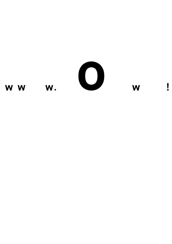
The studio Raffinerie developed its new corporate design
based on an infinitely variable logo system that expresses
a passion for wordplay. Each permutation tells its own story.
The «Neutra Face» font was derived from a prototype
by Austrian architect Richard Neutra.
by a great graphic-design studio based in Zurich: Raffinerie


Nessun commento:
Posta un commento