&?
found on http://friendsoftype.com/


Counter Print
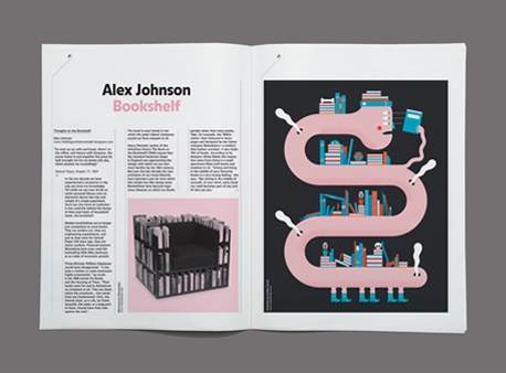
Eight:48's fifth issue, 'Counter-Print: Cover to Cover',
is all about books!
Their design, the collecting of them and the storing of them.


Typography rules!
For me, one of the most awesome and most successful work
for a corporate design with almost only typography…
when you imagine: this was for a theater, where images normally rule.
«Die Burg» is the most influential playwright’s theater
in German-speaking Europe.
The studio Raffinerie developed its new corporate design
based on an infinitely variable logo system that expresses
a passion for wordplay. Each permutation tells its own story.
The «Neutra Face» font was derived from a prototype
by Austrian architect Richard Neutra.
by a great graphic-design studio based in Zurich: Raffinerie


We should shine a light on, a light on
And the book of right-on's right-on, it was right-on
We should shine a light on, a light-on
And the book of right-on's right-on, it was right-on
I killed my dinner with karate
Kick 'em in the face, taste the body
Shallow work is the work that i do
Do you want to sit at my table
My fighting fame is fabled
And fortune finds me fit and able
And you do say - oh oh
That you do pray - oh oh
And you say that you're okay
And do you want to run with my pack?
Do you want to ride on my back?
Pray that what you lack does not distract
And even when you run through my mind
Something else is in front, oh, you're behind
And i don't have to remind you to stick with your kind
And you do say - oh oh
That you do pray - oh oh
And you say that you're okay
And even when you touch my face
You know your place
And even when you touch my face
You know your place
And we should shine a light on
A light on
And the book of right-on's right-on
It was right-on
And we should shine a light on, a light on
And the book of right-on's right-on, it was right-on
Marco Bertozzi va a Venezia! Auguri!
Biennale di Venezia 2011
Padiglione Italia/Accademia
Tese di San Cristoforo all'Arsenale n. 92-93-94
04 /06 - 31 /10 2011




japanese-design-genius
Shigeo Fukuda (born in 1932 in Tokio)


functional, fanciful, bewilderingly intricate, or disarmingly simple, the work of this artist is always flavored with that pinch of mischievous humor which we have come to recognize as his mark. wether he is cutting out paper dolls, solving problems in combinatorial geometry or optical illusions, making simple drawings, or figuring out some highly complex sculptural puzzle, this same whimsical spirit prevails.
Noi sereni e semplici o cupi ed acidi,
noi puri e candidi o un po' colpevoli
per voglie che ardono:
noi cerchiamo la bellezza ovunque.
E noi compresi e amabili o offesi e succubi
di demoni e lupi, noi forti ed abili
o spenti all'angolo:
Noi cerchiamo la bellezza ovunque.
E passiamo spesso il tempo così,
senza utilità (quella che piace a voi)
senza utilità (perché non serve a noi)


